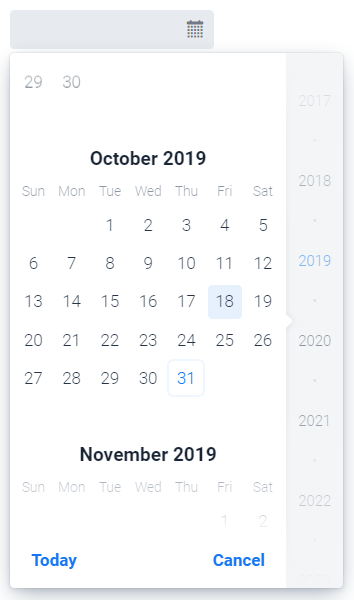
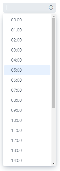
DatePicker and TimePicker
With these components, the user can enter a date or a time, respectively. When the field is clicked, a small dialog opens, in which the user can operate his selection.


Important properties:
-
Required - Indicates that the field must be selected before the user can click Next in a form, for example.
-
ClearButtonVisible - Displays a button with which the user can clear the set value.
-
Label - description displayed above the input field.
-
Placeholder - text that will be displayed if no value has been entered yet.
-
Min - The smallest possible value that can be entered.
-
Max - The largest possible value that can be specified.