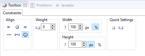
Toolbox
The toolbox can be used to change the positioning and size of a component. Unlike the properties such as DefaultVerticalComponentAlignment, these do not affect the default settings of the child components.
-
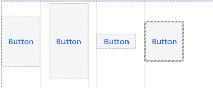
Align - This allows to change the alignment of the component.
-
 Alignment: Sets the alignment of the component *against the layout direction right, center, left or top, center, bottom.
 -
 Alignment Baseline: All components in a row are aligned based on their inner labels.
-
Works only in conjunction with a "HorizontalLayout"
-
-
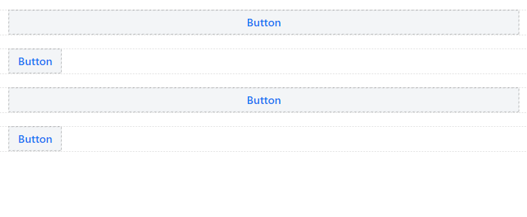
 Stretch property: The component is stretched against the layout direction.
-
Works only in conjunction with a "VerticalLayout".
-
Overridden by setting fixed pixel values
-
-
 Property Auto: Component can be controlled by global settings of the parent container.
-
-
Weight - Controls the width or height of a component in relation to all other components in the layout direction.
-
Example: 5 components → Weight: 1-1-1-1 → Allocation: 20%-20%-20%-20%.

-
Example: 5 components → Weight: 1-1-0-0 → Allocation: 50%-50%-MIN-MIN-MIN

-
Example: 4 components → Weight: 3-3-1-1 → Split: 37.5%-37.5%-12.5%-12.5%.

-
-
Width/Height - This allows the size of the element to be set directly. A fixed value in pixels or percent overrides any other setting assigned by the parent or in the alignment.
-
 Undefined: Size is controlled by the Parent Layout / Children component.
 -
 Pixel / Percent: Size is determined by the component itself directly.
-
-
Quick Settings - Here the weight of an element can be adjusted by one click.