Accordion
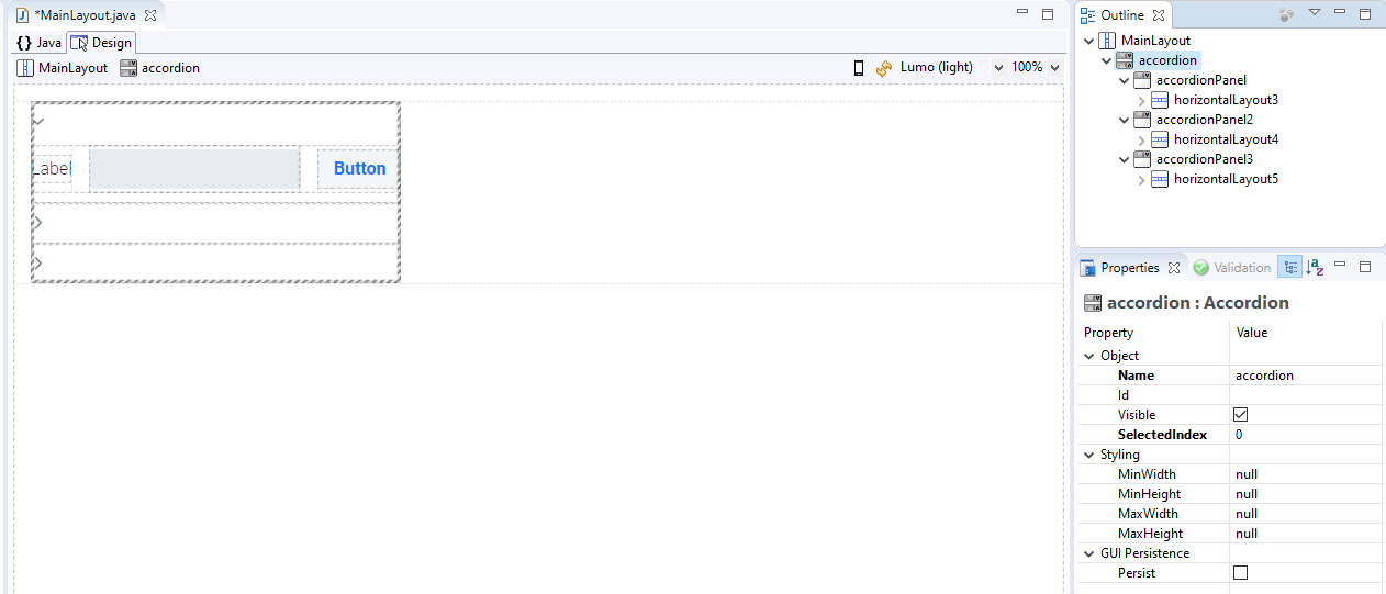
The Accordion is similar to the Detail component, with which the user can expand and collapse information. The difference is that only one AccordionPanel at a time can be expanded per Accordion. AccordionPanels can be added to an Accordion by drag and drop.

-
The Object > SelectedIndex property determines which AccordionPanel is opened first after loading the Accordion.
-
The Object > SummaryText property can be used to add a description to AccordionPanels, which will be displayed next to the expand and collapse icon.