Layouts
To design a graphical user interface consisting of several UI components, you need a layout. Layouts have the task of arranging the individual UI components of a graphical interface and fully automatically control the behavior of the UI components when the size of the parent container changes (including program window, browser window, device display, screen resolution). As soon as you insert a UI component into a layout, it is automatically positioned according to the special rules of the respective layout and the layout is reorganized. Additional settings options in the toolbox allow you to define the behavior of each UI component. RapidClipse offers you a total of 6 different layout types:
-
VerticalLayout - Arranges component below each other.
-
HorizontalLayout - Arranges component side by side.
-
FlexLayout - Arranges components next to each other. If there are too many components next to each other, more components will be arranged underneath.
-
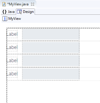
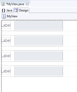
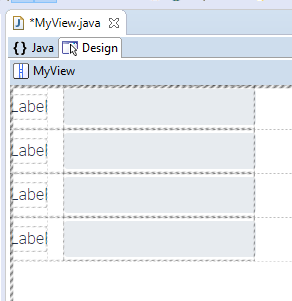
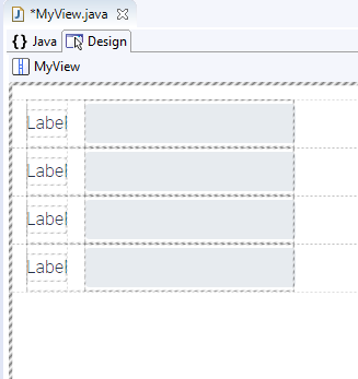
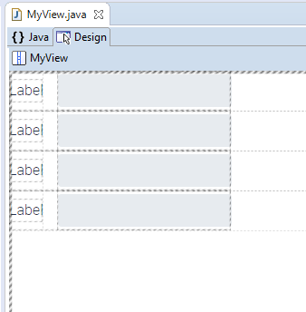
FormLayout - Arranges component evenly in a grid.
-
SplitLayout - Creates two windows separated vertically by a splitter by default.
|
Outside distance (Margin)
In the Properties > Margin an outer margin can be defined between the edge of the container and the UI components laid out in it. For all layouts, the outer margin is disabled by default.
Without external distance:
With outer spacing: (note the distance between the highlight borders and the outer menu).