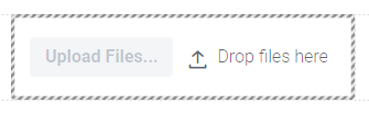
Upload
The Upload component allows the user to upload files. When the user presses the Upload Files button, a dialog opens, with which the user can then select the files he wants to upload.
Important properties:
DropAllowed - Specifies whether the user can upload files via drag and drop. DropLabel - The text which will be displayed when the user uploads a file by drag and drop. MaxFiles - The maximum number of files that the user can upload through the upload component. MaxFileSize - The maximum size that the file the user wants to upload may have.